css小方法
小方法
- 鼠标变手型:cursor:pointer;
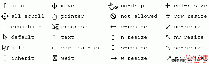
- 鼠标手型变禁用的:not-allowed
- 文本框蓝色边框取消掉:outline:none; 或 outline:0;
- 修改边框的颜色:caret-color: red;
- 隐藏元素还占位:visibility:hidden;
- 隐藏元素不占位:display:none;
- 隐藏复选单选框默认样式:-webkit-appearance:none;
- qq截图可以直接取色,按住ctrl键可以查看16进制的颜色;
- 快速复制网页内容:打开f12控制面板,输入以下两种方法都可
document.body.contentEditable = truedocument.designMode = 'on'
- 禁止谷歌翻译一段内容:添加类名
class='notranslate' - 快速找到开机启动:
shell:startup - 作图的时候从上到下,从左到右
- 取行高,从字的头部开始到下一行的头部,几行字就乘几行,算文字行高值,一行文字直接算高度就是行高。
- 内联块回车会引起多一个空格的情况,删除回车即可解决
- 字体高度等于行高,就可以解决文字上下的高度。
- 给盒子设置padding值,在有设置宽高的时候,设置多少padding值需要减去对应的宽高值,给盒子设置margin值不需要修改对应的宽高。
- a标签里面设置内容,只有选中内容才会出现手型,不设置内容表示整个框都会出现手型。
- auto左右自动对齐,不能上下自动对齐,可以设置多个值,可以设置:margin: 20px auto 0;
- 可以给盒子设置margin-top:-1px; 压上面的盒子1px;
- 重复使用率高的,常用自己的一个代号字母加下划线组成一个名字。
- 书写时考虑提高样式重复使用率。
- 充分利用自身html属性及样式继承原理减少代码量。
- 背景图片尽可能使用sprite技术,减少http请求
- 给a标签写#top,可以直接回到顶部
- 网站后缀加favicon.ico获取网站logo图标;
- 在设置line-height时尽量使用em单位,这样只需要修改font-size即可;
快速解决github翻译问题
在浏览器开发者工具输入以下内容并回车
document.querySelectorAll('pre').forEach(item=>item.classList.add('notranslate'))
元素不可点击
pointer-events: auto/none
当设置为none时,元素不可被点击;
可以设置button、a、input等等
用途:在input框上,使用label标签替换掉placeholder内容(设置好定位),当点击时,想输入文字时会点击到label的文字上,可以加入该属性,不让点中;

vh和vw单位
使用calc可以通过计算%、px、rem、vh、vw的高度;
表达式(+、-、*、/、)中间必须有空格隔开
比如:height: calc(100vh-100px);
复杂的计算:
width: calc((6.25%*4) + (2.08333333%*3));快捷键
alt+ctrl+方向键 改变屏幕的方向
特殊字符
| 空格符 | | |
|---|---|---|
| < | 小于号 | < |
| > | 大于号 | > |
| & | 和号 | & |
| $ | 人民币 | ¥ |
| © | 版权 | © |
| ® | 注册商标 | ® |
| ℃ | 摄氏度 | ° |
| ± | 正负号 | ± |
| x | 乘号 | × |
| ÷ | 除号 | ÷ |
| ² | 平方2(上标2) | ² |
| ³ | 立方3(上标3) | ³ |
logo写法
写页面logo的时候,需要写div>h1>a,
之后给a标签设置,text-indent为负值,overflow:hidden隐藏文字,给a标签设置背景图片logo图;
text-indent 隐藏链接里面的文字,overflow:hidden,最好写上,避免用户缩小网页也能看见
掘金头像旋转
#pic:hover {
      transform: rotate(666turn);
      transition-delay: 1s;
      transition-property: all;
      transition-duration: 59s;
      transition-timing-function: cubic-bezier(.34,0,.84,1);
}
1turn表示360°旋转;
相对定位
- 在未知大盒子和小盒子的宽高度的时候,让小盒子相对于大盒子垂直居中显示,
答案:设置子元素相对于父元素定位,设置4个定位为0,获取到四个角落,设置margin:auto。
.box{
    position: absolute;
    left: 0;
    right: 0;
    bottom: 0;
    top: 0;
    margin: auto;
}- 在未知大盒子的宽高度,已知小盒子的宽高度,让小盒子相对于大盒子垂直居中显示。
答案:设置子元素相对于父元素定位,设置left:50%;。right:50%,设置完之后位置会下来,设置margin-left为宽度的一半的负值,设置margin-top为高度的一半的负值,
.box{
    position: absolute;
    left: 50%;
    right: 50%;
    transform: translate(-50%,-50%);
}
溢出文字隐藏
white-space 用于强制一行显示内容,不换行。
normal:默认换行;
nowrap:强制在一行显示所有文本,直到文本结束或者遇到br。
overflow:hidden; 超出隐藏 不能省略这句话;
text-overflow:ellipsis; 溢出文字变为省略号。
精灵图滑动门(常用于导航栏样式)
示例:微信官网导航栏;
- 一个a标签包裹一个span标签。
- 给a标签一个左边的小圆角部分背景图,给span标签一个右边的小圆角部分背景图。
- 给a标签转行内块,设置宽高文字颜色等,左边一个padding-left将文字挤到中间,如果转块是默认占一整行。
- 给span一个右边的padding,把文字挤到中间去,输入文字会自动拉长图片。
注意:鼠标滑动时改变第二张精灵图的样式,要设置backgrund-image,不要直接设置背景图,否则会平铺和左边对齐。
搜索框写法
<div class="box">
    <input type="search"><button>123</button>
</div>
给box盒子添加大小,给search设置高宽,给button设置高宽,设置背景图。
文字滚动marquee
direction=方向
方向有四个值,不需要引号;
滚动速度: scrollamount滚动速度
scrolldelay滚动延时
需要引号
:target
.item:target .box{
    display: block;
}
让类名item的a标签,点击之后改变类名item下的box的样式;可以替代点击事件;
横向可以滚动
<div class='parent'>
    <div class='item'></div>
</div>.parent {
white-space: nowrap; /* 不换行 */
overflow-x: scroll; /* 横向滚动 */
}
.item {
display: inline-block;
}currentColor
是当前元素color属性的值
div{
    color: red;
    border: 1px solid currentColor;
}
滚动条
::-webkit-scrollbar 滚动条整体部分
::-webkit-scrollbar-thumb 滚动条里面的小方块,能向上向下移动(或往左往右移动,取决于是垂直滚动条还是水平滚动条)
::-webkit-scrollbar-track 滚动条的轨道(里面装有Thumb)
::-webkit-scrollbar-button 滚动条的轨道的两端按钮,允许通过点击微调小方块的位置。
::-webkit-scrollbar-track-piece 内层轨道,滚动条中间部分(除去)
::-webkit-scrollbar-corner 边角,即两个滚动条的交汇处
::-webkit-resizer 两个滚动条的交汇处上用于通过拖动调整元素大小的小控件
隐藏滚动条
.box::-webkit-scrollbar{
    display: none
}

.container::-webkit-scrollbar {!*滚动条整体样式*!
    width: 10px;     !*高宽分别对应横竖滚动条的尺寸*!
    height: 8px;
}
.container::-webkit-scrollbar-thumb {!*滚动条里面小方块*!
    border-radius: 10px;
    -webkit-box-shadow: inset 0 0 5px rgba(0,0,0,0.2);
    background: #535353;
}
.container::-webkit-scrollbar-track {!*滚动条里面轨道*!
    -webkit-box-shadow: inset 0 0 5px rgba(0,0,0,0.2);
    border-radius: 10px;
    background: #EDEDED;
}
设置全局的box-sizing
:root{box-sizing: border-box}
*{box-sizing: inherit}
或者:继承box-sizing方法;
html{box-sizing: border-box}
*,::before,::after{box-sizing: inherit;}
indeterminate 不确定伪类
- 复选框使用,复选框必须配合js;
checkbox.checked = true // 设置为选中状态
checkbox.indeterminate = true //设置半选状态
:indeterminate 可以选中半选状态, 需要通过js来设置indeterminate为true,
- 单选框使用,
(1)单选框的使用条件:必须多个单选框绑定了相同的类名;
(2)达到条件1可以直接使用:indeterminate类来设置样式;
(3)单选框的IE浏览器不支持
<input type="radio" name='radia'>
<label for="">1</label>
<input type="radio" name='radia'>
<label for="">2</label>
<p></p>p:after {
content: '已经选中了'
}
:indeterminate ~ p:after {
content: '您还没有选中呢';
color: red;
}原生css设置变量
变量设置到
:root标签上面,所有的类名都可以使用该变量;
设置到元素上面,只有该元素能够使用;
使用--*; 来定义变量的名称;
使用var();来使用变量;
:root{
--blue_color: #fff;
}
div{
background: var(--blue_color)
}
div {
--before_color: red;
--after_color: blue;
&::before {
color: var(--before_color);
}
&::after {
color: var(--after_color);
}
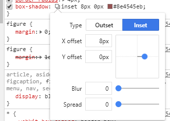
}设置阴影
可以通过给元素添加阴影,实现边框,在浏览器f12可以调试,添加内阴影;
图片居中算法
(屏幕的宽-图片的宽)/2
当两张图片居中: (屏幕的宽度的一半 减去图片的宽度)再除以2
BEM规范
- BEM(block(块) Element(元素) modifier(修饰符))
- 使用规范
- __ 块和元素之间使用双下划线
- -- 元素和修饰符之间使用双中划线,也使用_单下划线;
- - 多个单词使用单中划线区分
.search-form{}
.search-form__button--hover{}
CSS滑过切换图片
<div class='demo'>
    <img src='/open.png' />
    <img src='/close.png' />
</div>img:last-child{
display: none;
}
demo:hover{
img:first-child{
display: none;
}
img:last-child{
display: block;
}
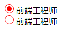
}实现radio框
只写主要代码
<div>
    <input type='radio' id='ipt' hidden>
    <label for='ipt'></label>
    <span>前端工程师</span>
</div>label {
width: 10px;
height: 10px;
border: 1px solid red;
border-radius: 100%;
padding: 2px; /*留出2px的白色空间;*/
display: inline-block;
background-clip: content-box; /*以内容开始绘制;*/
}
input:checked + label{
background-color: red; /* 必须-color,可以避免给padding也变红色;*/
}
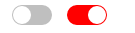
实现CSS开关
<input type='checkbox' id='toggle' hidden />
<label for='toggle' class='switch'></label>.switch{
display: inline-block;
width: 40px;
height: 20px;
background: rgba(0,0,0,.25);
border-radius: 20px;
position: relative;
transition: all .3s;
}
.switch::after{
position: absolute;
top: 1px;
left: 1px;
content: '';
width: 18px;
height: 18px;
border-radius: 18px;
background: white;
transition: .3s;
}
input:checked + .switch{
background: red;
}
input:checked + .switch::after{
transform: translateX(20px);
}
使用:valid(有效)和:invalid(无效)校验表单
配合pattern,不需要js就可以实现验证;
<input pattern='' />
input:valid{} /*选中输出正确的时候,可以修改样式;*/
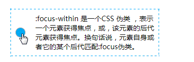
input:invalid{} /*选中输入无效时的样式*/:focus-within 伪类选择器
它或它的后代获得焦点,当他的后代input框获得焦点后,则可以进行css样式设置,类似冒泡;
:focus是用于input框发生的,:focus-within可以给Input框的父元素写;
不需要js就可以实现更改图片;
<div class='user'>
    <input />
    <img src='' />
</div>
<img src='' />.user:focus-within img{} /*当input获取焦点会触发里面的样式;*/
.user:focus-within ~ img{} /*当input获取焦点设置user同级的img隐藏;*/
.user:not(:focus-within){} /*选中父元素下没有获取焦点的元素;*/:placeholder-shown 伪类选择器
当input标签使用了placeholder属性有了默认点位的文字,会触发此伪类样式,可以配合:not()伪类,再改变文字的样式;
<input placeholder=''/>
<button>提交</button>input:placeholder-shown + button{
opacity: 0;
}
input:not(:placeholder-shown) + button{
opacity: 1;
}selection:文字被选中时的样式
div::selection{
    background: #fe6e66;
    color: #fff;
}
页面变灰
在body中加入:class='be-gray'
.be-gray{
        filter: grayscale(100%);/*IE浏览器*/
        -webkit-filter: grayscale(100%);/*谷歌浏览器*/
        -moz-filter: grayscale(100%);/*火狐*/
        -ms-filter: grayscale(100%);
        -o-filter: grayscale(100%);
        filter:
                progid:DXImageTransform.Microsoft.BasicImage(grayscale=1);
        -webkit-filter: grayscale(1);/*谷歌浏览器*/
}
实现转圈的效果CSS
background:
    linear-gradient(90deg, #03a9f4 50%, transparent 0) repeat-x,
    linear-gradient(90deg, #03a9f4 50%, transparent 0) repeat-x,
    linear-gradient(0deg, #03a9f4 50%, transparent 0) repeat-y,
    linear-gradient(0deg, #03a9f4 50%, transparent 0) repeat-y;
background-size: 8px 1px, 8px 1px, 1px 8px, 1px 8px;
background-position: 0 0, 0 100%, 0 0, 100% 0;
animation: linearGradientMove .5s infinite linear;

@keyframes linearGradientMove {
    100% {
        background-position: 6% 0, -6% 100%, 0 -6%, 100% 6%;
    }
}
filter 给图片添加过滤效果
blur(5px) 图片使用高斯模糊效果
brightness(200%) 图片变亮
grayscale(50%) 图片变灰;
hue-rotate(90deg) 色相旋转,图片里面的色相;
scroll-behavior 滚动平滑
给需要滚动的地方添加该属性,可以给滚动界面增加平滑过渡效果
当给a标签设置返回顶部时,会瞬间回到顶部,可以给html和body 或滚动区域设置属性,会慢慢回到顶部
html,body {
    scroll-behavior: smooth;
}

/*js操作点击滚动到元素*/
box.scrollIntoView({
    behavior: 'smooth'
})
/* box是需要显示的元素位置 */
overscroll-behavior 连锁滚动
当在子元素里面滚动时,滚动到底会触发父元素的滚动,给子元素添加此属性,则可以避免滚动父元素了;
.message {
    overscroll-behavior: contain;
}
滑过显示四条边的动画
四条边会慢慢合拢
background: linear-gradient(0, $red 2px, $red 2px) no-repeat left top/0 2px,
    linear-gradient(-90deg, $red 2px, $red 2px) no-repeat right top/2px 0,
    linear-gradient(-180deg, $red 2px, $red 2px) no-repeat right bottom/0 2px,
    linear-gradient(-270deg, $red 2px, $red 2px) no-repeat left bottom/2px 0;
/* 设置之后需要设置background-size,才有颜色;*/
/* 给滑过增加宽度, 即可实现, 注意添加transition;*/
:hover{
    background-size: 100% 2px, 2px 100%, 100% 2px, 2px 100%;
}
点击整个页面
<div onClick={} style={{
    position: 'fixed',
    top: 0,
    left: 0,
    right: 0,
    bottom: 0
}} />
解决中文溢出换行英文不换行
word-break: break-all;  /* 只对英文起作用, 以字母作为换行依据*/
word-wrap:break-word; /* 只对英文起作用,以单词作为换行依据*/
white-space:pre-wrap; /* 只对中文起作用,强制换行*/
white-space:nowrap; /* 强制不换行,都起作用*/
white-space:nowrap; overflow:hidden;
text-overflow:ellipsis; /*不换行,超出部分隐藏且以省略号形式出现(部分浏览器支持)*/
快速查看html元素位置信息
html * {
    outline: 1px solid red;
}
画加载的小圆圈loading
.dot{
    width: 20px;
    height: 20px;
    border: 4px solid rgba(0,0,0,.1);
    border-left-color: #7983ff;
    border-radius: 50%;
    animation: dots 1.2s cubic-bezier(0.275, 0.515, 0.440, 0.115) infinite;
}
@keyframes dots{
    from {
        transform: rotate(0)
    }
    to {
        transform: rotate(360deg)
    }
}
划过让兄弟元素变透明
<div class='demo'>
    <span>Item1</span>
    <span>Item2</span>
</div>span{
transition: opacity: 0.2s;
}
.demo:hover span:not(:hover){
opacity: 0.5;
}垂直居中
添加dibvm类名之后无论高度都会居中;
<div class='dibvm'>哈哈</div>.dibvm:after{
content: "";
display: inline-block;
height: 100%;
vertical-align: middle;
}动态变三角形

<div class='demo'>
    <span></span>
    <span></span>
    <span></span>
</div>.span{
width: 25px; /*25最合适*/
height: 2px;
background-color: #494847;
margin-bottom:6px;
transition: .3s;
transform-origin: left; /* 以left为起点旋转;*/
}
.demo {
display: flex;
justify-content: center;
align-items: center;
flex-direction: column;
width: 40px;
height: 40px;
}
.demo:hover span:nth-of-type(1){
transform: rotate(45deg)
}
.demo:hover span:nth-of-type(2){
opacity: 0;
}
.demo:hover span:nth-of-type(3){
transform: rotate(-45deg)
}top固定头部,鼠标向下时隐藏,向上时显示
.main-header {
    position: fixed;
    top: 0;
    left: 0;
    bottom: 0;
    right: 0;
    height: 50px;
    z-index: 9999;
    transition: all .2s;
    transform: translate3d(0,-100%,0);
}
.main-header.visible {
    transform: translateZ(0);
}data: _ => ({
currentTop: 0
}),
created () {
// 进入时创建添加滚动事件
window.addEventListener('scroll', this.handlerScroll)
},
beforeDestroy () {
// 组件卸载时清除滚动事件
window.removeEventListener('scroll', this.handlerScroll)
},
methods: {
// 判断头部是否显示隐藏
handlerScroll () {
let scrollTop = document.documentElement.scrollTop || document.body.scrollTop
let el = document.querySelector('.index-header')
// 如果大于200则隐藏导航栏, 否则反之
if (scrollTop > 200 && scrollTop > this.currentTop) {
this.currentTop = scrollTop
el.setAttribute('class', 'index-header')
} else if (scrollTop > 200) {
this.currentTop = scrollTop
el.setAttribute('class', 'index-header visible')
} else {
el.setAttribute('class', 'index-header visible')
}
}
}画分隔线
<div class="title">我是分割线</div>.title{
position: relative;
text-align: center;
overflow: hidden;
font-size: 14px;
color: #999;
}
.title::before,.title::after{
content: '';
display: inline-block;
width: 100%;
height: 1px;
position: absolute;
background: #ccc;
top: 50%;
}
.title::before{
margin-left: -10px;
transform: translateX(-100%);
}
.title::after{
margin-left: 10px;
}
tabs下划线宽度改变如何居中
添加一个伪类,隐藏原来的颜色,前提是tabbar的underline不能有宽度
.am-tabs-default-bar-underline:after {
  content: '';
  position: absolute;
  width: 16px;
  height: 3px;
  background: #FF8833;
  left: 50%;
  transform: translateX(-50%);
}
高度等于宽度
如果是图片的话,可以设置背景图,因为没有高度是无法渲染的;
.box {
    width: 50%;
    height: 0;
    padding-bottom: 50%;
    background-color: red;
}
仅在IE下生效样式
小于IE9以下样式
<!--[if IE]>
  <link rel="stylesheet" type="text/css" href="all-ie-only.css" />
<![endif]-->
IE10或IE11
@media all and (-ms-high-contrast: none), (-ms-high-contrast: active) {
     /* IE10+ CSS styles go here */
}
微软Edge12可用
@supports (-ms-accelerator:true) {
  /* IE Edge 12+ CSS styles go here */
}